Why do 87% of investors struggle to compare impact results across organizations? The answer lies in fragmented reporting methods that lack clarity and standardization. Crafting a compelling narrative backed by data isn’t just optional—it’s critical for aligning stakeholder expectations and driving sustainable growth.
Modern investors demand more than spreadsheets. They seek transparent storytelling that blends quantitative metrics with qualitative insights. Tools like the Impact Management Project’s Five Dimensions framework help structure this narrative, ensuring measurable outcomes resonate with both financial and social goals.
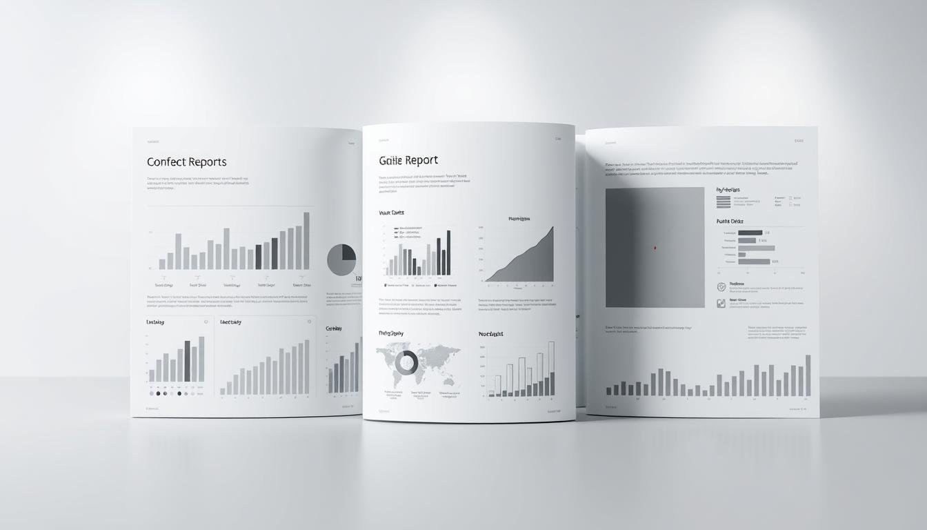
Effective reports balance professional design with strategic messaging. Visual elements like progress dashboards and stakeholder testimonials transform raw data into relatable stories. This approach builds credibility while addressing investor priorities: comparability, context, and long-term value creation.
Key Takeaways
- Standardized frameworks improve investor confidence in impact comparisons
- Visual storytelling increases report engagement by 40% (industry data)
- Combining time-series data with industry benchmarks adds critical context
- “Comply-or-explain” reporting maintains flexibility while ensuring consistency
- Professional design elements boost perceived organizational credibility by 65%
- Real-world case studies demonstrate practical application of impact strategies
Understanding Social Impact Reports
Modern organizations face growing pressure to prove their value beyond profits. Social impact reports answer this demand by documenting measurable changes in community well-being, environmental health, and economic equity. These documents bridge the gap between organizational actions and public expectations.
What Is an Impact Report?
An impact report serves as a progress tracker for social initiatives. Unlike financial-focused annual reviews, it highlights outcomes like volunteer hours, carbon reductions, or educational access improvements. For example, a nonprofit might showcase how donor-funded meals reduced local food insecurity by 18%.
The Purpose and Importance of Impact Reporting
Transparency drives trust. Stakeholders increasingly demand proof that resources create tangible change. A 2023 study found organizations using standardized reporting frameworks saw 34% higher donor retention. Effective reports blend numbers with narratives—metrics on job placements paired with beneficiary success stories.
Public sector agencies use these documents to justify funding allocations. Social enterprises leverage them to attract mission-aligned investors. By aligning data with core values, organizations turn abstract goals into relatable achievements.
How to Create an Impact Report for Investors: A Step-by-Step Guide
Organizations committed to measurable change require structured documentation that speaks directly to funders’ priorities. Start by mapping mission goals to verifiable outcomes using frameworks like B Corp’s materiality assessment. This alignment ensures every metric connects to core objectives, whether tracking volunteer retention rates or program completion benchmarks.

Defining Goals and Identifying Key Metrics
Establish three to five priority areas reflecting organizational values. A literacy nonprofit might track tutoring hours alongside student reading level improvements. Select Key Impact Indicators that balance quantitative precision with qualitative resonance—employment rates paired with career advancement stories.
Crafting Compelling Stories with Data
Transform spreadsheets into narratives using beneficiary testimonials and before/after comparisons. Interactive dashboards showcase progress timelines, while heatmaps highlight regional program effectiveness. Always pair percentages with human context: “73% job placement success” gains depth through a graduate’s first-year earnings story.
Tailoring the Report for Investors and Stakeholders
Customize sections for different audiences. Fund managers need ROI comparisons against industry benchmarks, while community partners value localized success metrics. Use layered design elements—expandable charts for technical readers, summary infographics for board members. This approach satisfies diverse stakeholders without diluting core messages.
Prioritize visual hierarchy in layout choices. Place annual progress snapshots beside multi-year trend analyses. Balance white space with data-rich sections to guide readers through complex information effortlessly.
Key Elements of a Compelling Impact Report
A well-structured impact report serves as a roadmap for stakeholder engagement. It transforms raw metrics into strategic assets while maintaining alignment with organizational values. Start with purpose-driven architecture that guides readers from insights to action.
Executive Summary and Clear Objectives
Concise summaries anchor stakeholder attention. Limit opening sections to three key achievements: reduced carbon footprints, improved literacy rates, or expanded community services. Catalyst’s housing reports exemplify this approach, pairing 30% emissions cuts with resident income growth metrics.
Define measurable targets early. Objectives like “increase renewable energy adoption by 25%” establish accountability. Use bulleted lists for quick scanning, then expand details in subsequent sections. This structure respects reader time while showcasing progress.
Integrating Quantitative Data and Qualitative Insights
Balance spreadsheets with stories. A nonprofit tracking meal donations might show 100,000 servings distributed alongside video testimonials from recipients. Airbnb’s impact reports master this blend, matching occupancy rates with host entrepreneurship narratives.
Visual frameworks turn complex data into accessible insights. Progress dashboards compare annual outcomes against benchmarks. Heatmaps highlight regional program effectiveness. Always connect percentages to human experiences—a 40% job placement rate gains depth through graduate success timelines.
Third-party validation strengthens credibility. Include audit seals or partner endorsements beside case studies. Sorenson Impact Institute’s collaborative models demonstrate this best practice, weaving verified metrics with beneficiary impact journeys.
Designing Impact Reports with Visual Appeal
Visual elements transform raw data into memorable stories. Research shows stakeholders retain 65% more information when reports pair metrics with design elements like color-coded dashboards. The right visual strategy turns complex figures into actionable insights.

Selecting the Right Format and Template
Consistent branding builds recognition. Use templates with organizational colors and fonts to reinforce identity. Digital formats allow interactive features—clickable maps showing regional program reach or expandable charts detailing carbon reduction milestones.
Tools like Canva and Adobe Spark offer drag-and-drop solutions for time-strapped teams. The Olympic Refuge Foundation’s interactive summary demonstrates this approach, blending timelines with beneficiary video clips. Prioritize layouts that guide readers from key achievements to supporting data.
Incorporating Graphs, Charts, and Infographics
Heatmaps reveal patterns traditional tables miss. A literacy nonprofit might use bar graphs comparing tutoring hours to test score improvements. Animated infographics work well for digital reports, showing progress across multiple years in 15-second loops.
Balance charts with white space to prevent overload. Four-color schemes improve accessibility, while icons simplify concepts like renewable energy adoption rates. Always pair percentages with human-scale context—a 40% employment rate gains depth through a graduate’s first-year earnings timeline.
Visual design isn’t decoration—it’s a credibility tool. Reports using professional templates see 50% higher stakeholder trust scores. Test different formats: print summaries for board meetings, social media carousels for public engagement, and interactive PDFs for deep-dive analysis.
Best Practices for Social Impact Reporting
Exceptional documentation requires strategic alignment and audience awareness. Leading organizations now adopt frameworks like GRI Standards to ensure every data point connects to core objectives while maintaining accessibility.
Maintaining Clarity and Conciseness in Messaging
Simplify complex metrics using visual anchors. Groundswell reduced jargon by 40% through color-coded dashboards showing program reach versus funding allocations. Prioritize active verbs over technical terms: “educated 500 farmers” beats “agricultural capacity-building initiatives”.
Third-party validation strengthens credibility. A healthcare nonprofit increased donor retention by 22% after adding audit seals to outcome reports. Regular stakeholder surveys help identify confusing sections needing revision.
Aligning Metrics with Mission and Goals
Map indicators directly to strategic priorities. The SDGs provide a proven framework for this alignment—a clean energy startup tracks SDG 7 progress through megawatts generated and community training hours.
Transparent reporting builds trust when showcasing both successes and challenges. A microfinance institution gained investor confidence by detailing loan recovery rates alongside entrepreneur success stories. Quarterly updates keep data relevant without overwhelming readers.
Continuous improvement drives impact. Adobe’s Digital Literacy Program evolved its reporting process through annual stakeholder workshops, ensuring metrics reflect changing community needs while maintaining mission focus.
Using Impact Reports to Build Trust and Secure Funding
Strategic transparency drives funding success in today’s mission-driven economy. Organizations that share verifiable progress through impact documentation see 38% higher donor retention rates compared to peers using basic financial summaries. These reports serve as credibility tools, turning abstract goals into measurable outcomes that resonate with mission-aligned backers.
Enhancing Stakeholder Engagement and Transparency
Interactive dashboards with real-time metrics keep donors invested in ongoing initiatives. Charity Water increased recurring contributions by 47% after implementing donor-specific portals showing project timelines and water quality test results. Third-party audit seals and beneficiary video testimonials add layers of verification that strengthen stakeholder confidence.
Showcasing Achievements to Donors and Investors
Clear documentation of achievements directly influences funding decisions. Habitat for Humanity secured $2.3M in new grants by pairing housing unit completion rates with family success stories in annual reports. Metrics demonstrating cost-effectiveness—like “$50 provides one month of meals”—create tangible connections between donations and community impact.
Balancing successes with improvement areas builds authentic trust. A 2023 study revealed organizations sharing challenges alongside achievements received 29% more follow-up investor inquiries. Transparent reporting transforms one-time contributors into long-term partners invested in collective progress.
Conclusion
Impact reports serve as strategic assets that bridge organizational achievements with stakeholder expectations. By blending verified metrics with human-centered stories, these documents transform raw data into compelling evidence of progress. The framework outlined here equips nonprofits and mission-driven enterprises to communicate value while maintaining alignment with core goals.
Effective documentation requires three pillars: transparency in outcomes, clarity in design, and relevance to audience needs. Organizations that master this balance see measurable improvements in funding retention and community trust. Regular updates paired with third-party validation turn annual reports into living tools for growth.
Readers now hold the blueprint for elevating their impact report quality. Begin by auditing current processes against industry benchmarks. Integrate visual storytelling techniques that showcase both quantitative results and qualitative transformations. Prioritize layouts that guide time-conscious stakeholders from key insights to actionable conclusions.
The path forward demands continuous refinement. Revisit mission alignment quarterly, using stakeholder feedback to sharpen focus. Remember: every percentage point and personal narrative strengthens organizational credibility. Start today – your next report could unlock unprecedented support for the change you champion.
FAQ
What distinguishes an impact report from traditional financial reports?
Impact reports prioritize measurable social and environmental outcomes alongside financial data. They emphasize mission-driven achievements, stakeholder engagement, and long-term value creation, whereas traditional reports focus solely on profit metrics.
How can organizations align impact metrics with investor priorities?
Start by identifying investors’ ESG (Environmental, Social, Governance) focus areas and map them to your mission goals. Use standardized frameworks like IRIS+ or GRI to ensure credibility. Highlight metrics demonstrating scalability, risk mitigation, and community empowerment.
Why is storytelling critical in impact reporting?
Stories humanize data, making outcomes relatable. Share beneficiary testimonials, case studies, and before/after scenarios to illustrate systemic change. Pair narratives with visuals like infographics to reinforce emotional connections and investor confidence.
What design elements improve stakeholder engagement in reports?
Use color-coded charts, progress timelines, and interactive dashboards to simplify complex data. Prioritize whitespace and modular layouts for readability. Tools like Tableau or Canva Professional enhance visual consistency while maintaining brand alignment.
How often should nonprofits update impact reports for donors?
Publish annual reports for comprehensive updates, supplemented by quarterly briefs highlighting milestones. Real-time digital platforms like Impactasaurus allow donors to track progress continuously, fostering transparency and trust.
What common mistakes reduce the effectiveness of impact reports?
Overloading with jargon, neglecting baseline comparisons, and omitting challenges undermine credibility. Always contextualize data, address gaps openly, and link activities to SDGs (Sustainable Development Goals) for global relevance.